Friday 21 January 2011

Front Cover Analysis One


The magazine "Vibe" is founded by the producer Quincy Jones. The magazine specialises in R&B and hip-hop music, also covering artists, actors and other entertainers from these genres.  The magazine production closed down in summer 2009, and was purchased by a private equity investment fund called InterMedia Partners.
The masthead is very catchy as it uses alliteration, “cool, crazy and crass.” The use of it draws the audience in and it sticks into the readers head. The title “Vibe” connotes colloquialism as it conveys a musical element, which can be interpreted as a way of identifying the youth. The front cover adhere the conventions of other music magazines within the same genre because many other music magazines have the same layout.
The main image of the magazine is Keri Hilson. The use of mise-en-scene is very vital, she is wearing a leather hat, which looks like an upgraded version of a police hat, this could add to the sell line of her being a “a very bad girl”. The use of jewellery or “bling” shows us that the target audience is again directed towards the teenagers as they are the people who normally buy these sorts of items.  The overall colours used in this magazine are white and red for the typography, black for Keri Hilsons costume and blue for the back ground. The text is written in red and white whom stands out as it is on the blue background, this contrast makes it easier for the audience to see and read the information giving.
The magazine “vibe” is targeted to the youth, from the ages 16 to 25. I say this because this age range is more aware of the genres R&B and hip-hop.  The sell lines show that the magazine is filled with gossip in the R&B and hip-hop genres. This connotes that the target audience is again aimed towards the mid teenagers, as they are interested in daily gossip.  The sell line “exclusive” shows the audience that the information in the magazine is new and would be very rare to find, which makes them eager to buy it. The colour scheme in the magazine is very basic as they only use two colours for the text. This makes it easier for the audience to see what the magazine has to offer them as they are not bombarded with different colours. The layout of the magazine shows the artist Keri Hilson in the middle, around her are all of the topics that are going to be covered in the magazine, this allows the audience to know what is going to be featured in the magazine before they buy it. The use of alliteration, “cool, crazy and crass,” also grabs the audience’s attention as it is very catchy. “Has been a very bad girl,” this sell line draws attention to the word very as it is written in bold red letters and is slightly bigger than the rest of the of the words, this shows stressing on the word very and it makes the audience think that Keri Hilson has done something remotely wrong.The main image is of Keri Hilson. The connotations of the main image are to show Keri Hilson as being seductive. The use of mis-en-scene allows us to see this as her body language and her clothing is very feminine and seductive which makes the reader automatically see her as the main image as they are drawn in by her appearance. Her clothing is very eye- catching as it compliments her woman figure which would most likely attract young teenage boys.


Thursday 20 January 2011

Front Cover Analysis Two


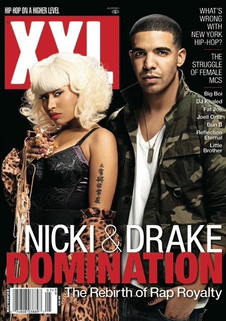
XXL is a hip hop magazine and was published by Harris Publications.  It was founded by former source staffers and other Harris Publication employees, as they wanted to produce their own magazine, including the genre hip hop and culture. The magazine past editors were Elliott Wilson and Datwon Thomas.
The mast head “Hip-Hop on a higher level,” catches the audience’s attention as it is use of alliteration. The title “XXL” is written in white and red on a background of black, these colour contrasts allows the title to stand out and as it is in capital letters, it stresses on the importance of the name. The main sell line is also written in red and white capital letters, showing the audience what the main topic of the magazine is going to be about. The sell lines of the magazine tells the reader what to expect in the magazine if bought, therefore, using original sell lines will convince the reader to buy the magazine because it is new, updated information and gossip. The sell line also includes different artists names, showing the audience which artists are featured in the magazine, which is beneficial to the audience because they know who is in the magazine before even buying it.
The magazine XXL specialises in the genre R&B and Hip Hop. The front cover shows us that the target audience for that magazine is around 16 to 25 years of age. I say this because the sell lines on the magazine would only interest people within that age range.  The design aspects also stress on the target audience. This is because the typography is very mature and based towards the target audience. The black background connotes sophistication and shows us that the target audience are more within the grown up age. The red and white text contrasts the background and so the audience can read the information given with ease. Both genders male and female social groups are represented on the front cover, mostly targeted towards the teenage age, as they are most likely to dress like the artists and would have a major interest in the genre of music that they produce.
 The audience are being addressed by the use of rhetorical questions. This language device is very intriguing and makes the reader feel more involved as they make up the answer in the head and think about it. Another language device is used to address the audience and that is the use of alliteration. “What’s wrong with New York hip-hop? And the rebirth of rap royalty, this device hooks the reader in to reading the magazine.
The main image is of the artist’s Drake and Nicki Minaj. Drake is represented as a stereotypical man, who is strong and brave, the use of military clothing helps show this, as it gives of a masculine image. The “dog-tag” that he wears comes originally from the army as it was a way to recognise everyone, this again goes with his militant image. Drake’s short army like hair also connotes him image. Nicki Minaj is represented as a stereotypical woman. She is dressed in a leopard print gown, which is half coming of her left hand, revealing a Chinese tattoo. This shows conventions as many R&B and Hip-Hop artists have tattoos. For example, Eminem, Cheryl Cole, Dappy (N-Dubz) and Rihanna. Nicki Minaj is also stereotyped as a woman as she is wearing makeup; this is stereotype for most female artists because they always want to look good. Nicki is also wearing a vest like top, revealing her womanly figure. The gold jewellery in her hand connotes her being a wealthy artist. The magazine “XXL” adhere other typical R&B and Hip-Hop magazine front covers, this is because the layout and choice of around three colours are common in the genre of these magazines.


Wednesday 19 January 2011

Front Cover Analysis Three


The magazine “classic fm” specialises in the classical genre.  It is published every month and is the printed organ of the British classical commercial radio station, Classic FM. The magazine is targeted towards the ages of around 40 plus.  I say this because the people featured on the magazine are dressed in an elderly smart manner. For example, the man on the right hand corner of the magazine is dressed in a suit, resulting to the magazine being targeted to the age range 40 plus. The magazine sell lines are very informational, and are very to the point. “100 CD’s, books, DVD’s rated,” this sell line makes the audience aware of what the magazine is going to contain before even buying it. The number “100,” stands out as it has a different background colour than the other words, this stresses on the number 100 and shows the audience what the motif is. “Plus FREE best live music guide!” is another sell line that draws the audience in as the word free is in capital letters, which can be seen as the magazine is giving away something original at no price. The sell line “Fiddler on the surf” is a pun on the film Fiddler on the roof; people who are interested in classical music would understand this pun and could refer back to it.
The masthead is in front of the main image, which is unusual. This is because in normal magazines, the masthead is behind the main characters face. The word “favourite” is written in red which tells the reader and convinces them that it is UK’s most wanted classical magazine. In the western culture we usually read from left to right a go down. The magazine has published to major features in the magazine that would convince the reader to buy the magazine. The “free CD” is written at the start of the magazine and it is the first thing that we see, and in the bottom right hand corner we see “plus FREE best live music guide!” which is the last thing we see. These sell lines encourage the audience to buy the magazine.
The main image is of Myleene Klass, she is represented as a sophisticated and respected woman. She also looks the age of the target audience, this could also convince the target audience to buy the magazine as they can refer to the woman’s maturity. She has natural looking makeup on, which also refers back to the target audience as they also look respectable like Myleene Klass in the picture. Her clothing is also very graceful, which refers back to the target audience as being more established and in the working environment. The way she is posed in the magazine goes with the target audience and the genre of the magazine, is say this because, if she was dressed in a very seductive way, then it wouldn’t combine with the music magazines genre.
The design of the magazine is very packed; nearly every part of the page is filled with information for the audience which shows that the magazine is targeted to the more mature age who likes reading. The main colours used in the magazine are red, white and black. The text is mostly written in red and black on a white background. This dissimilarity makes it easier for the audience to read the information given to them with no difficulty. The use of alliteration “My musical mission,” pulls the reader in and makes them feel more interested.  The font of the title “classic fm” is written very refine and elegant.
Myleene Klass is a guest editor in the magazine, this is a unique selling point of the magazine because no other classical music magazine will have this feature, and this may also persuade the audience to buy the magazine. The reader who buys s the magazine will be offered a free CD; this would induce the reader to buy it as they are getting a “two for one” offer, as when buying the magazine the reader is also getting a free CD. This could be because sales of magazines and CD’s are decreasing as the years go on, due to the use of internet, and by giving away a free CD could pull the reader in, to buy the magazine.