XXL is a hip hop magazine and was published by Harris Publications. It was founded by former source staffers and other Harris Publication employees, as they wanted to produce their own magazine, including the genre hip hop and culture. The magazine past editors were Elliott Wilson and Datwon Thomas.
The mast head “Hip-Hop on a higher level,” catches the audience’s attention as it is use of alliteration. The title “XXL” is written in white and red on a background of black, these colour contrasts allows the title to stand out and as it is in capital letters, it stresses on the importance of the name. The main sell line is also written in red and white capital letters, showing the audience what the main topic of the magazine is going to be about. The sell lines of the magazine tells the reader what to expect in the magazine if bought, therefore, using original sell lines will convince the reader to buy the magazine because it is new, updated information and gossip. The sell line also includes different artists names, showing the audience which artists are featured in the magazine, which is beneficial to the audience because they know who is in the magazine before even buying it.
The magazine XXL specialises in the genre R&B and Hip Hop. The front cover shows us that the target audience for that magazine is around 16 to 25 years of age. I say this because the sell lines on the magazine would only interest people within that age range. The design aspects also stress on the target audience. This is because the typography is very mature and based towards the target audience. The black background connotes sophistication and shows us that the target audience are more within the grown up age. The red and white text contrasts the background and so the audience can read the information given with ease. Both genders male and female social groups are represented on the front cover, mostly targeted towards the teenage age, as they are most likely to dress like the artists and would have a major interest in the genre of music that they produce.
The audience are being addressed by the use of rhetorical questions. This language device is very intriguing and makes the reader feel more involved as they make up the answer in the head and think about it. Another language device is used to address the audience and that is the use of alliteration. “What’s wrong with New York hip-hop? And the rebirth of rap royalty, this device hooks the reader in to reading the magazine.
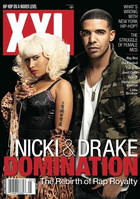
The main image is of the artist’s Drake and Nicki Minaj. Drake is represented as a stereotypical man, who is strong and brave, the use of military clothing helps show this, as it gives of a masculine image. The “dog-tag” that he wears comes originally from the army as it was a way to recognise everyone, this again goes with his militant image. Drake’s short army like hair also connotes him image. Nicki Minaj is represented as a stereotypical woman. She is dressed in a leopard print gown, which is half coming of her left hand, revealing a Chinese tattoo. This shows conventions as many R&B and Hip-Hop artists have tattoos. For example, Eminem, Cheryl Cole, Dappy (N-Dubz) and Rihanna. Nicki Minaj is also stereotyped as a woman as she is wearing makeup; this is stereotype for most female artists because they always want to look good. Nicki is also wearing a vest like top, revealing her womanly figure. The gold jewellery in her hand connotes her being a wealthy artist. The magazine “XXL” adhere other typical R&B and Hip-Hop magazine front covers, this is because the layout and choice of around three colours are common in the genre of these magazines.
No comments:
Post a Comment