Monday, 21 February 2011
Sunday, 20 February 2011
Positions


Here are some of my ideas on how i want my model to pose. The style is chosen by other R&B artists. I want to experiment with different poses to see which pose suites my magazine the most. And as my magazine is an R&B music magazine i think that these poses suit my genre. The use of Mise-en-scene has also shown me how my model should be dressed and what sort of props i need to include in my pictures.
Friday, 18 February 2011
My Fonts
1) Beatz
2) Beatz
3) Beatz
4) Beatz
5)Beatz
6) Beatz
7) Beatz
8) Beatz
9) Beatz
10) Beatz
11) Beatz
12) Beatz
13) Beatz
14) Beatz
15) Beatz
Thursday, 17 February 2011
Contents Features

This is a brainstorm on what is going to be featured in my R&B music magazine. I did this by researching different contents pages and seeing what was featured in their magazine. All magazines that I researched had the "gigs/concerts" and "interviews." therefore in my magazine I am going to make sure that I have both features in my magazine,
Magazine Names

Here I have brainstormed possible names for my R&B music magazine. The names "amplifier" and "beats" looked most appealing to me, so therefore in my focus group I gave the choice between the two. The other names in my brainstorm were done by thinking of words that associate with R&B and Hip-Hop.
Wednesday, 16 February 2011
Front Page Sketch One

This sketch is a plan on how I want my front page of my R&B music magazine to look like. The main image will be in the middle so the audience can focus on it, with the sell lines surrounding it. The magazines name will be behind the main image but still visible, with the mast head on top. The biggest sell line will be on the main image to show the audience what the main story line is.
Front Page Sketch Two

This is my second front page sketch. I want sell lines to surround my main image and i also want additional images to surround the main image so that my audience know what else is featured in my magazine. The masthead and title will be in the top left hand corner and will have a big font so that it appeals catchy towards my audience.
Contents Page Sketch

This is a sketch of my R&B music magazines contents page. In the bottom left hand corner, I am going to have an editorial; this is because in the magazines that I researched, most had an editorial. The biggest image on the contents page is going to be on the main story, and the other small stories are going to be on the right. The feature list is going to be in the middle so that it is the first thing the audience will see.
Double Page Sketch One
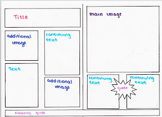
This is a sketch of one of my double page spreads. I want to have one main image and two floating quotes with additional images. The title will be at the top of the page. I took this idea by looking at other RNB music magazines.
Double Page Sketch Two


This is my second double page spread sketch. i want my double page spread to have additional images to keep the audience more interested and i also want a main image to make sure that my audience know who the interview is about without having to read the interview first. I also want to make sure that i have a subheading where i can tell the audience what the interview is going to be about without them having to read all of it. Therefore if they do like what the interview is about they will want to read on more.
Wednesday, 9 February 2011
Tuesday, 8 February 2011
Double Page Analysis One

This double page spread is taken from the music magazine NME. The first thing that would catch the audience’s eyes is the main picture and the title of article, which is a floating quote from the article itself. The main image would attract the audience as it would allow them to see what the article is about without reading it fully, by doing this, the audience as able to see if they can recognise the artist and to see if they would want to read the article. The title has a rough newspaper look, which goes with Lily Allen’s features. As she is dressed in scruffy bold clothes and her make up being very dark, it shows major comparison with the title as it gives of the same affect. Her clothing is very masculine as she is wearing a fully covered tartan shirt; however she styles it out with the use of jewellery. Both the title and the main picture are taking up the majority of the double page spread stressing on the important of both of them. It is still eye catching as it is the main thing you can see. Her pose with her hands on her waist also allows the audience to see her tattoo on her wrist, this shows the audience that she stereotypes with other artists as many RNB and hip hop artists have tattoos. Her body language allows the audience to see that she is in control and has power. Lily Allen is looking straight at the audience showing them that she is addressing them directly and again stresses with the fact that she is very brave and strong, showing her masculinity.
The structure of the page is very simple and easy to read as the interview is shown in just the bottom left. The interview is very short, showing us that there is not much information in it. The article is written in columns making it easier for the audience to read the magazine, and it is also a feature that is common to all magazines.
The language in the article is very simple and also shows colloquialism. This shows us that the target audience of the magazine itself is the ages 13 to 20. The type of language would make the reader feel more involved and interested in the article because they would be able to understand it and interpret it.
The colours used in this double page spread are very limited as it only uses red white and black. The black and white again stresses with the newspaper theme. The red shirt that Lily Allen is wearing is the only attractive colour on the page, this allows the audience to automatically look at her as it is the only form of contrast they can see, and it attracts them. The black boxed text contrasts the white background, making it very easy for the audience to read the interview and to focus on the main image.
The interview itself is written in black, as the name Lily Allen is written in bold red it allows the reader to see who the interview is about. If they couldn’t recognise the artist by the picture, they would automatically see the highlighted name Lily Allen and know that the interview is about her, without having to read it all first.
Double Page Analysis Two

This double page spread is taken from the music magazine XXL. The main image is of a band named “The XX.” The theme of the magazine is very mysterious and secretive; i say this because the colours used are very dull and bland, giving of a very dark and shadowy vibe. The language used in this extract is very formal as it is in Standard English, showing us that the target audience would be of a more mature age and would be able to understand this form of writing. The article is written as a continuous prose which is normally used for journalism and is unconventional for a RNB music magazine and not as a Q&A, which is what we would normally expect in a RNB music magazine, this therefore shows us that the target audience of this article is mostly presented to an older audience.
The big masthead and long subheading is very unconventional as it is very unusual for a music magazine, this is because it restricts the amount of space for the vital information on the band. As the subheading is very long, it can be seen as a mini introduction, this is beneficial to the audience as they can see what the article is going to be about.
The use of rhetorical questions in the introduction allows the reader to think about the question and to come up with the answer in their head, this makes them feel more involved and helps them interpret what the article is going to be about. This saves them time as they only have to read the introduction to find out what the main article is about, and if they find it interesting then they may want to read on. The typography in the article is kept very constant and simple, making it easier for the audience to read the article. The only change in the style of writing is when the magazine writes the name of their magazine, NME in italic, this reinforces the reader that they are reading a NME magazine.
The main image of the group shows that the woman is placed in the centre of the image beside the two men; this shows us that they are protecting her. She is portrayed as androgynous, as she is dressed very manly and her hair is cut short. She and the man on the left hand side are looking directly at the camera showing direct address, this shows the audience that they are bold and brave and that they aren’t afraid of anything. However the man on the right hand side is looking down and away from the camera, this shows the audience that he lacks confidence and is the most venerable out of them all. The band’s name “the XX,” shows us that they are very rebellious and provocative; this shows us that the target audience of the magazine are targeted towards adults from 18 onwards who experience this sort of behaviour and are familiar to it. The body language of the band shows us that they are very expletive and disobedient.
Monday, 7 February 2011
Contents Page Analysis One

The features on the contents page show us that the target audience of the magazine is for both male and female; this is because in the fashion section, vibe caters for both male and female. In all vibe contents pages there is always a V on the background. This makes the audience aware that they are looking at a vibe magazine. The artist Ciara, who is featured in the contents page, has her legs in a V shape. This again reinforces that the magazine is by vibe. Vibe has 3 contents pages; the 1/3 shows the audience which page they are on. They do this to allow them to have one main image on the contents page. The audience can focus on just that one image. The way the woman on the magazine is posed gives of a seductive vibe, which allows the audience to see that she is flaunting her famine features.
The target audience can be both women and men, this is because, the seductive pose attracts men, as she is seen as a sex symbol and could also be for women because they could see her as a role model. The way Ciara is presented in the magazine goes with the feminine film critic Laura Mulvey, she argued “To-be-looked-at-ness”, which meant that the male benefited with the way women were presented in media and films as they were shown to offer visual pleasure. However, this is not to say that the women audiences are completely alienated as they can see her as being an empowered woman and they will be able to identify with her. Gratifications theorists claim that audiences consume music and other forms of media as they want to be able to identify with them.
The colour schemes used in this contents page are very dull, as they only use different shades of black and white. These colours attract a specific target audience of being older as they aren’t too bright. The language is written in informal; this could be because of the target audience.
Contents Page Analysis Two

NME's contents page is much organised as it has subheadings of the information in the magazine, for example, it has a News, Reviews and Features categorised into different parts. The main picture on the contents page is of the Astoria which is one of the main venues for gigs in London and is well known worldwide. on the left hand side in red are names of bands that are going to be in the magazine, with the page number that they are going to be featured on, this is a very organised structure as the audience can just look up the band or artist that they want to read about and go straight to that page. This also shows us that this magazine is quite big as it has such a large number of artists and bands to cover in the magazine. This contents page is targeted more towards the age range of 18-30, I say this because this age range would know about the Astoria and may have visited it. The advertising on the bottom of the contents page attracts the reader in as it is seemed as a reward; this is because if they sign up to the magazine, then they would save £45, this might convince them to subscribe to the magazine. on the right hand side at the bottom it shows the audience that the magazine has a guide for Uk's number 1 gigs, this shows us that the magazine is targeted to people who are interested in attending gigs. The layout and composition is busy which is very effective and attracting. The colour scheme used is red, black and white. As these colours contrast each other it stands out. The colours show the brand identity which runs through the magazine which automatically identifies to the audience that it is an NME magazine. The category “Live!” has an exclamation mark at the end of it, shows us that it is an exclusive feature in the magazine, which may draw in the reader
Subscribe to:
Posts (Atom)